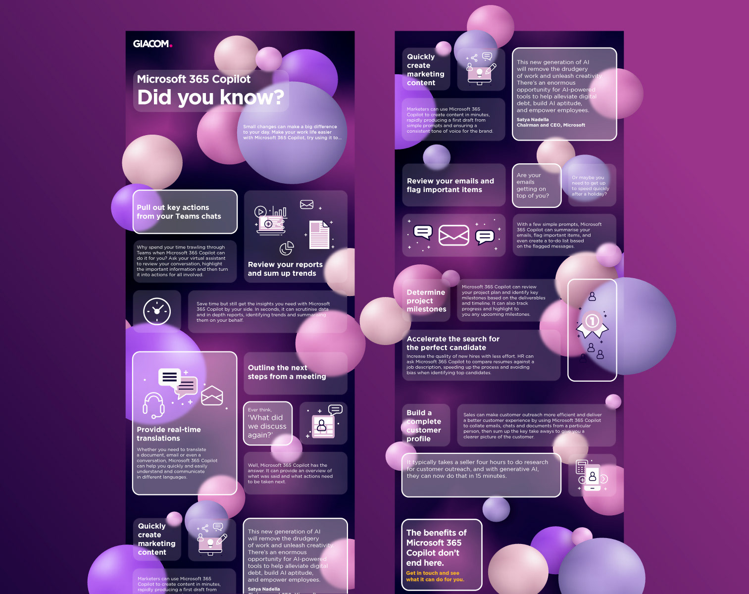
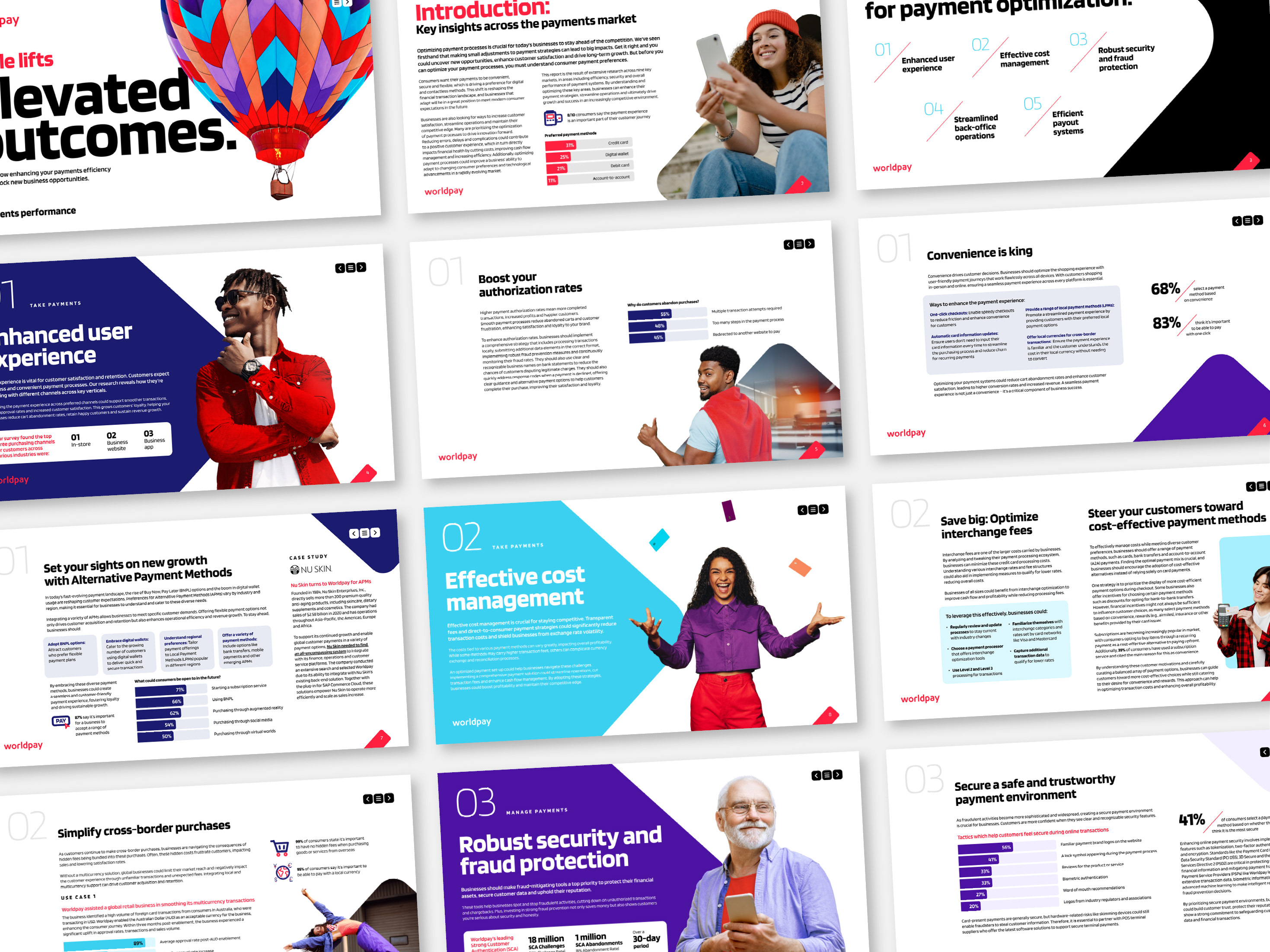
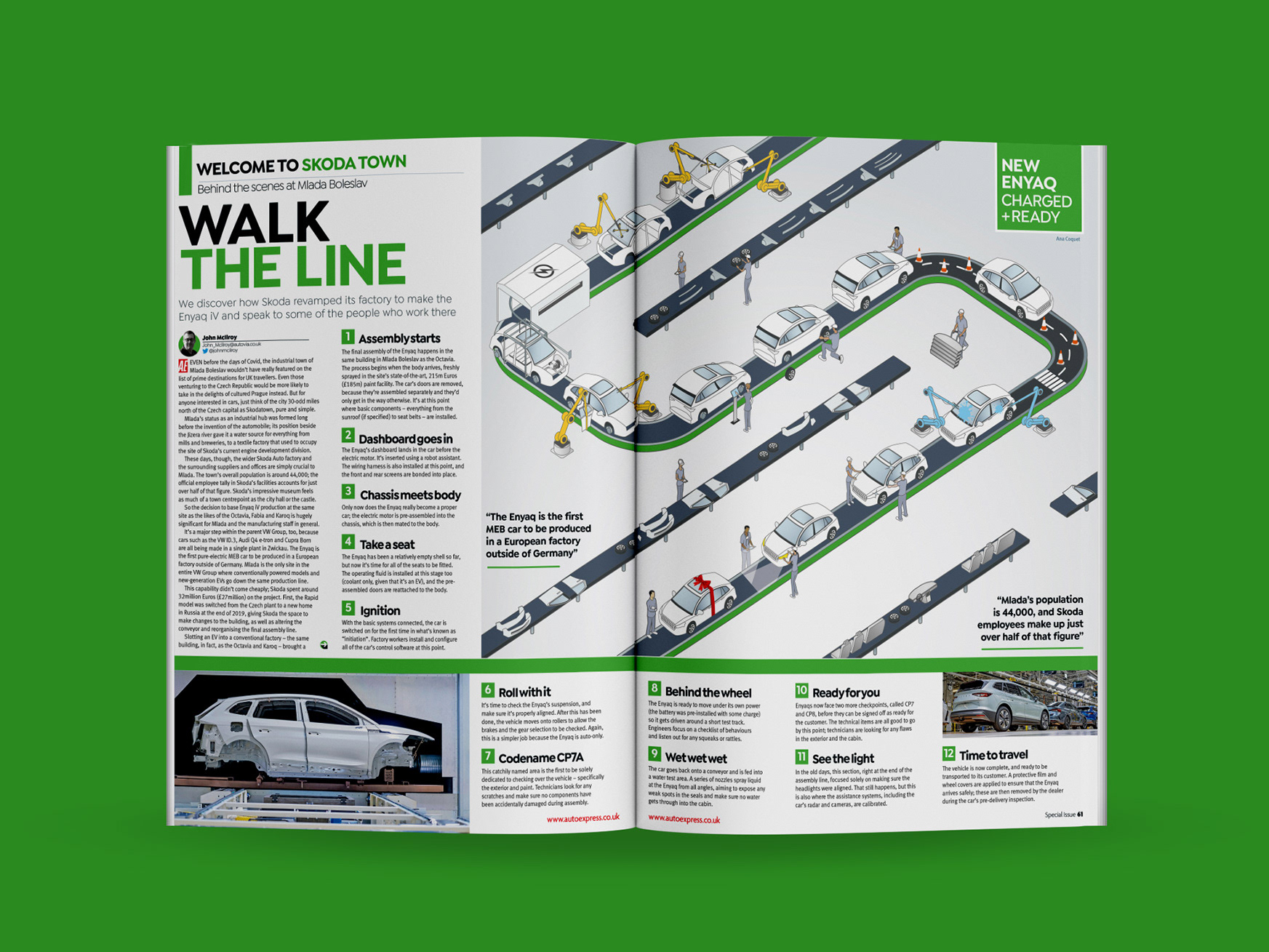
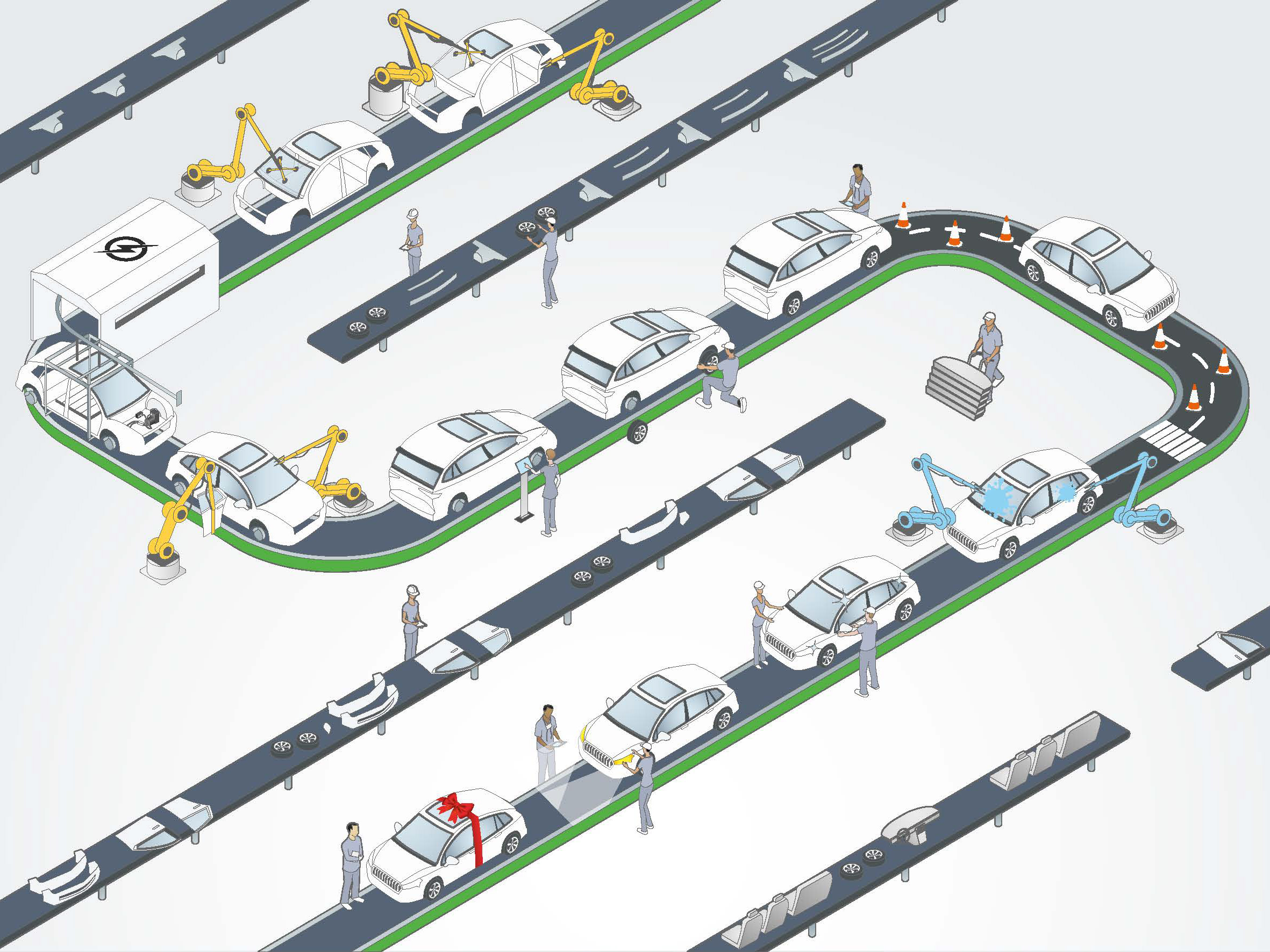
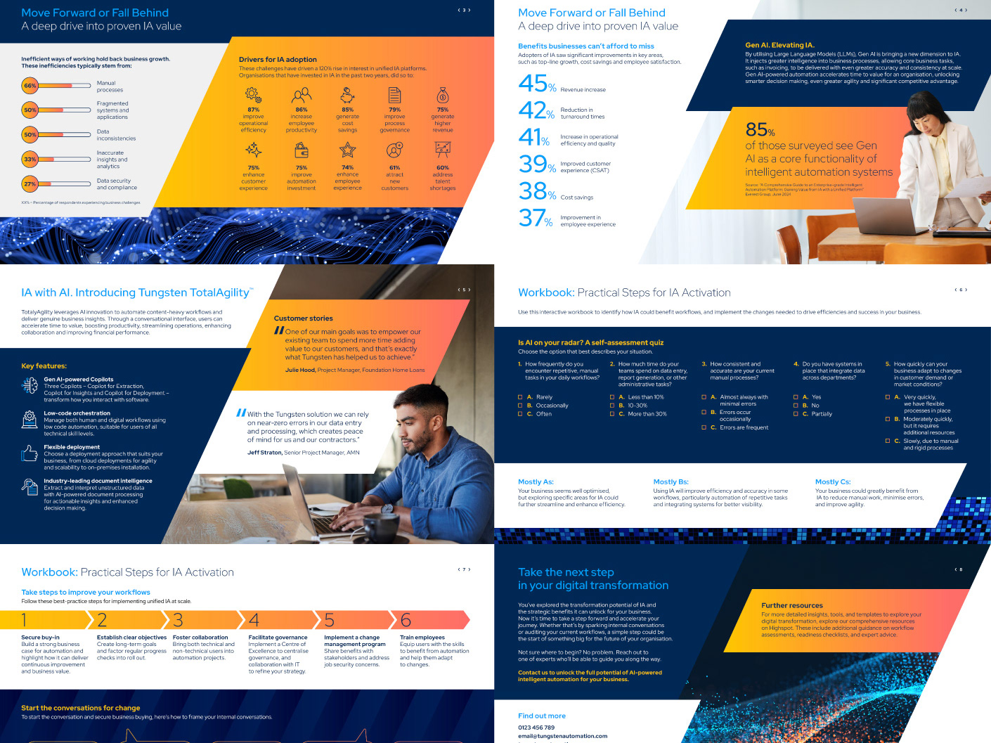
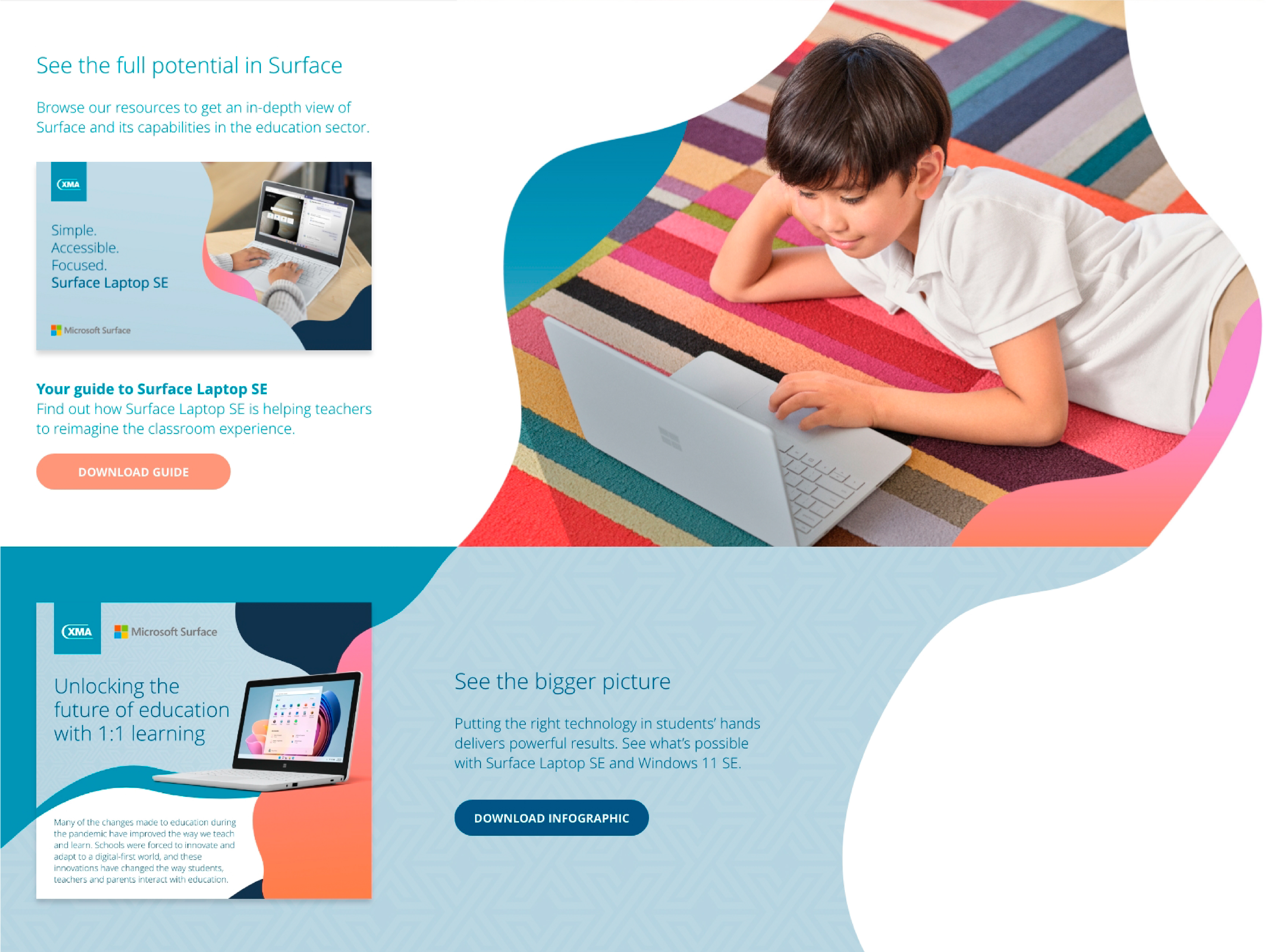
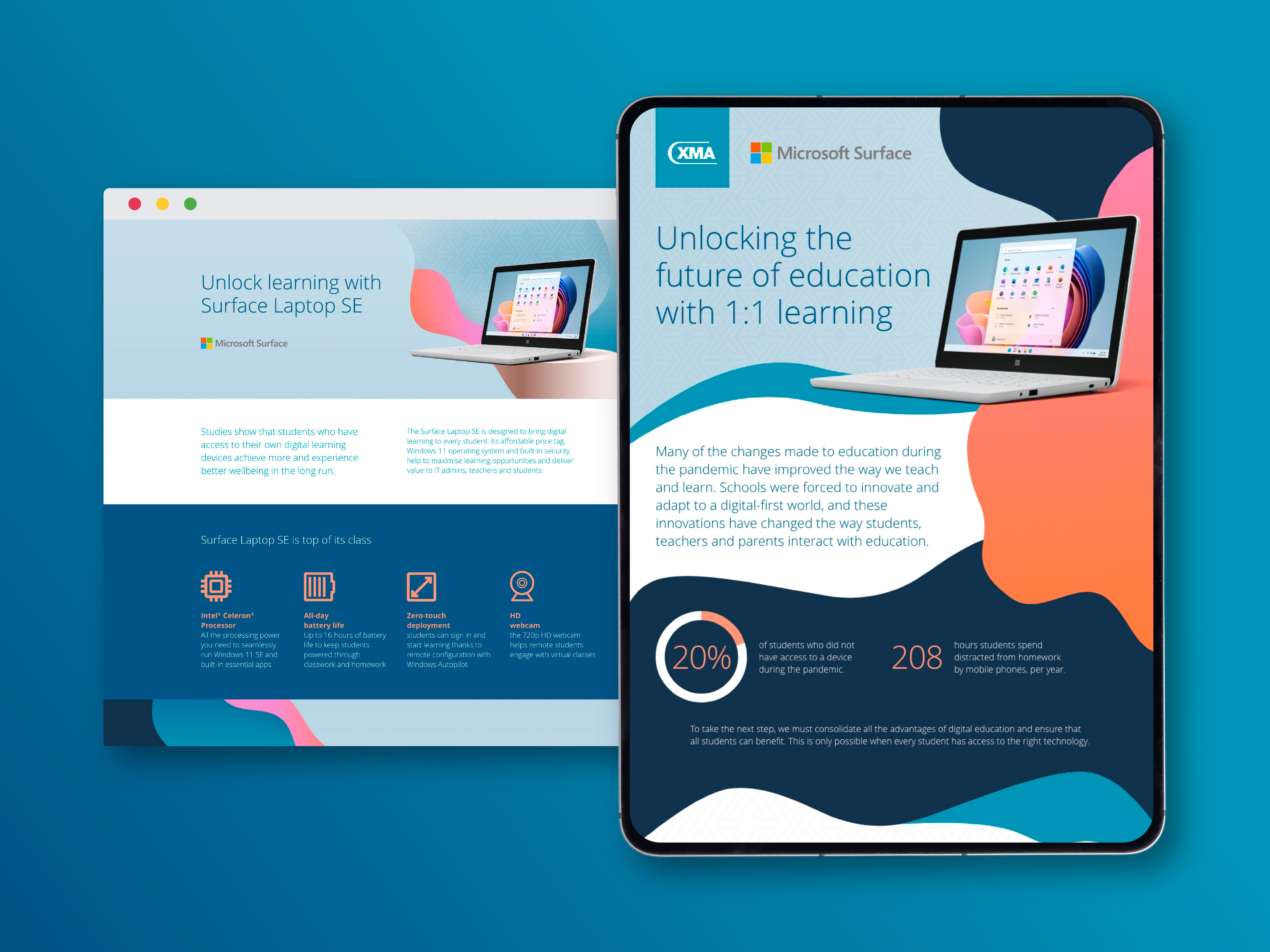
Objective
Develop an informative campaign piece to highlight the benefits of Microsoft Copilot through Giacom, using their newly refreshed brand guidelines. Further down the line, the visual identity needed to be adaptable across multiple channels while remaining clear and engaging.

My role

Building on an initial visual direction developed by a colleague, I refined and expanded the campaign look and feel. Adopting the 3D spheres as a campaign-specific element which nods back to the pink dot in the logo, and introduced a “bento box” layout approach to cluster information, making the content more digestible and engaging while staying true to the brand guidelines.

Challenges

The client initially pushed for an infographic format, but the content was too detailed to suit that structure. The challenge was to create a solution that presented the information clearly without overwhelming the audience. The bento box layout allowed for clarity, flow, and engagement, encouraging readers to stay with the content until the end.

Outcome

A dynamic long-scroll design tailored for digital platforms, which Giacom could share with clients to communicate Copilot’s benefits and secure buy-in. The piece balanced brand consistency with campaign-specific creativity, delivering an engaging and functional solution.

See more...

Back to Top